Do good with Data
Data are like pick up sticks. Before you sort and analyse they are just a mass of sticks, all different colours and sizes scattered on the floor. You can’t infer much about the group of sticks from one stick alone. But one by one, you pick them up and sort them. Colour by colour. Length by length. It takes time but eventually each individual stick is grouped with those alike. Then you can finally answer questions like how many sticks there are? What colour is the most prevalent? What is the most common size? If you have a second set of pick up sticks maybe you might want to compare them and ask which set has the most red sticks?
Often data are spoken of as easily readable information in the media but in reality they are only points of information; A click on an advertisement, a loyalty card point, a survey box answer, a ‘like’ of a friend’s profile photo. Data are analysed by companies, governments, and scientists to provide insight into a host of things from shopping habits to public health. It predates the digital era too as census data was collected by hand for millennia. In 1854, a doctor named John Snow mapped the data points of where individual cases of cholera emerged onto a street map of London. He tracked the data to the Broad Street water pump and became the first to discover that Cholera was a water borne disease. Alone, isolated, a singular datum doesn’t speak, but correlated, data can speak volumes if the right questions are asked. The highly entertaining blog Spurious Correlations shows that the wrong questions when comparing data sets can lead to erroneous assumptions. If you asked if there was a correlation between cheese consumption and engineering degrees, for example, the 95.86% correlation between the per capita consumption of mozzarella cheese and civil engineering doctorates awarded might lead you to believe there is.
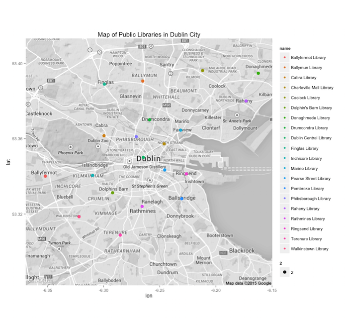
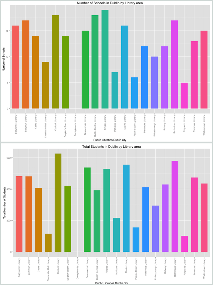
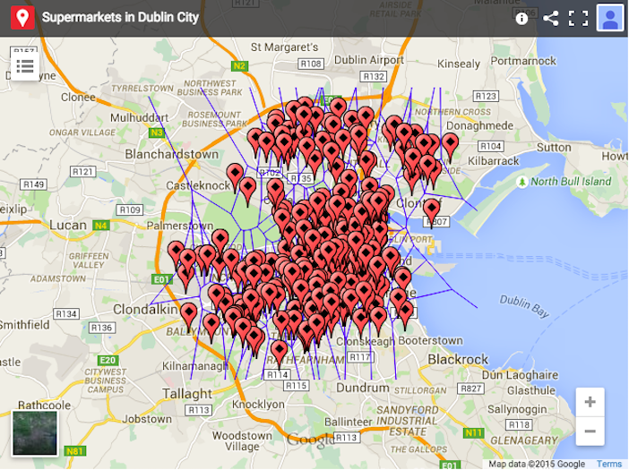
Don’t be put off by this though, data analysis and visualisation can be infinitely useful in even the most basic situations. Take the question where should I live? The images below that visualise schools, libraries, and supermarkets in Dublin were created by data science consultant, André Ríos who recently moved to Dublin, and might help you find your answer.


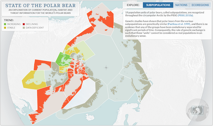
The right questions, the right people, and the right data set however, has the potential to solve great humanitarian problems, help fight disease, and allocate resources to those in need. Data is often associated with hacking scandals and privacy wars but it doesn’t always have to receive bad press. There are many individuals and companies doing great things with data. Google flu and Google dengue fever trends anonymise and utilise search data for terms such as fever and their corresponding location to show emerging outbreaks of disease. Armed with early warning health agencies can save lives. Random Hacks of Kindness events have been held in forty cities to tackle a variety of social problems. Their idea is to identify and develop practical open source technology tools to confront complicated local and global problems. Periscopic are a data visualisation firm that analyses data and beautifies the results for companies to help protect Polar bears, create awareness of the causes of breast cancer, show gender discrimination and highlight global child poverty. The visualisations they create are very powerful. Their motto: Do Good with Data.

DataKind is a voluntary organisation that seeks to help charities tackle problems with data science. They have expanded from their New York HQ to Dublin, Bangalore, London, San Francisco, Washington DC, and Singapore. Dublin was chosen for its wealth of data analysts that work for a collection of the world’s largest internet firms with European headquarters in the city and for Ireland’s long history working with international aid charities. The voluntary data ‘do-gooders’ work with charities and not for profits to help them make the most out of their data pick up sticks. This weekend, May 16th and 17th they are hosting a DataDive event to work with Concern, Mathletes, Volunteer Ireland and the Childhood Development Initiative. They are hoping to help these four charities understand and improve their operations, marketing, and strategy using business & data analysis, predictive modelling, and visualisation. If you know a thing or two about data and want to do good go to the event webpage and volunteer.
The problem our world has is not too little information but too much data. We need data analysts to make sense of it and extract useful information from the masses of digital datum we produce daily. It isn’t just scientists who will need to learn these skills in the future. If you are interested in learning the skills you need to analyse and code data into beautiful visualisations look to online education sites such as Coursera and Udacity. Just remember, with great power comes great responsibility. So do good with your data.
